Have you ever tried reading an image post on social media only to find it impossible because the font size is just too small? Because, same. I know just how easy it can be to not fully understand how small the text will look on the finished product while you’re designing it, especially when using a desktop to create an image that will be viewed on a mobile device. So, I’ve written down these handy guidelines to give you a jumping off point when you’re creating your content.
Every individual font has its own individual letter widths and spacing between the letters. This can make giving a one-size-fits-all (Get it? Ha! I crack myself up sometimes) font recommendation a little tricky. For that reason, I’m using Helvetica as the base font for my suggestions. You’ll have to compare every font you use separately to see whether it can be smaller than the minimum I’ve recommended.
Most of the time, fonts are measured in points (pt), which is the unit that I’ve used in these suggestions. Canva also uses this even though they don’t specify it. So don’t worry if that’s the design program that you use and only a number is listed, not a unit.
My personal recommendations:
- Facebook: Don’t go smaller than 22pt.
- Instagram (for image posts and carousels): Don’t go smaller than 43pt.
- Reels/Videos (for all platforms that use 1080px by 1920px): Don’t go smaller than 38pt.
- LinkedIn: Don’t go smaller than 28pt.
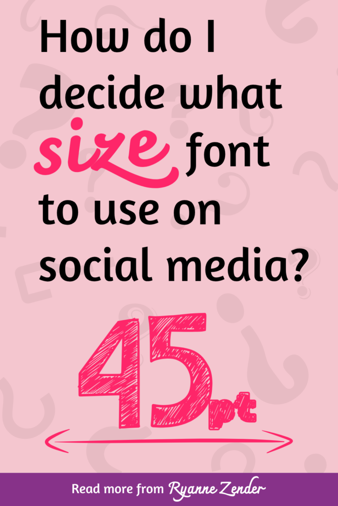
- Pinterest: Don’t go smaller than 45pt.
Like I’ve mentioned, these are just guidelines (and ones that err on the side of caution at that). The physical size of each individual mobile device’s screen size can have an effect on how the font sizes look. Unfortunately, you can’t always account for people who have smaller than normal screens. You’ll just have to hope for the best and use your own phone as a baseline.
When in doubt, make a test design and post it. Then, judge for yourself whether you think the text is legible from a mobile device. If you think it’s too small, then delete the post and make the font bigger. Then try again. This process can get rather tedious though, which is why I created these guidelines in the first place.
I do want to note that there is a trend on LinkedIn where people intentionally post infographics with tiny text intending for each user to download the image and zoom-in. If this is something that you like to do, or plan on doing, then my primary suggestion for you is to make sure that when your image is zoomed-in, the font isn’t so small that it’s blurry and illegible. The best way to double check this is to post the image and then look at it using the mobile version of LinkedIn.
It’s possible that sometimes you need to have some text that you aren’t super concerned whether it’s legible or not. If that’s the case, then throw my recommendations out the window and go with what feels right. While I would advocate for always using a font size that is easy for everyone to read without straining, I don’t know the specifics of your design and what your primary goal for it is. I just hope that with the suggestions I’ve made, you’ll be able to create your social media designs with more confidence.
All the best,
Ryanne Zender
Disclaimer: While marketing is based in part on statistics and psychology, it is not an exact science. Every business and market are unique. What may work for one business, will not necessarily work for another. There are no guarantees in marketing, and this post is for informational and educational purposes only and does not replace professional advice. You can check out the full list of disclaimers and disclosures here.